
Often, when reviewing icon sets from beginners, the most common issue is mismatched sizes and a lack of visual consistency. This almost always stems from the absence of a proper icon grid and keylines. But what exactly are these foundational tools, and why are they so crucial for your designs?
Icon design demands precision and systematic thinking. An icon grid provides that foundational framework, ensuring visual consistency, scalability, and crystal-clear clarity across an entire icon family.
In this article, we'll dive deep into what an icon grid truly is, explore its essential components, highlight the profound benefits it brings to your icon design workflow, and crucially, discuss when to strategically break them for optimal visual impact. By the end, you'll have a solid understanding of what an icon grid and keylines are, their advantages, and how to effectively use and even break them to elevate your icon design.
What is an Icon Grid?
An icon grid is a pixel-based system of guides, keylines, and spacing rules that icon designers use to maintain visual consistency and alignment. Its primary purpose is to ensure uniform size, optical balance, scalability, and harmony when icons are viewed together in a user interface. Without a proper grid, icons can appear inconsistent, leading to visual 'noise' and hindering legibility.
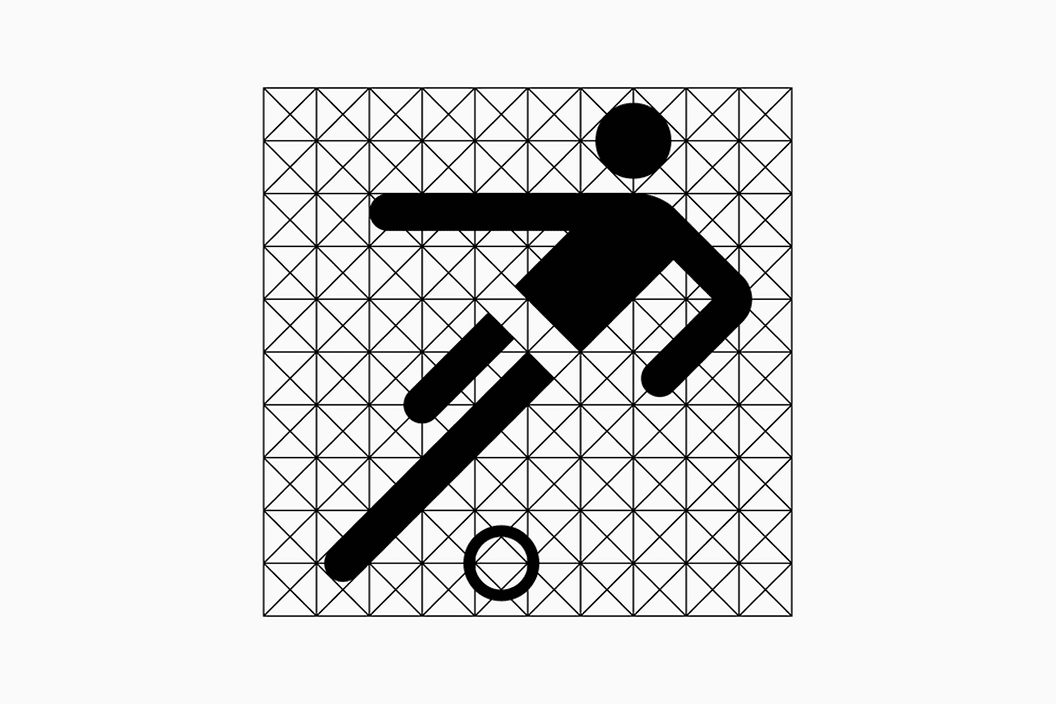
The use of grids in icon design was popularized by German graphic designers, Otl Aicher and Gerhard Joksch. He set the standard for modern icon design with the pictorgrams he created for the 1972 Munich Olympics.
Key Components of an Icon Grid:
Every icon grid consists of three key components: the frame, the grid, and the padding. Each element plays a specific role in ensuring visual consistency. Together, they provide a solid foundation for designing cohesive and well-structured icon sets.
Frame:

The frame marks the icon's boundary, acting as a consistent container for all design elements. It determines your icon's size, which is uniform across a set. Frames come in various sizes, chosen based on project needs. Common sizes are 16x16px, 24x24px, and 48x48px. Any elements outside the frame may appear misaligned or cropped.
Grid:
The grid guides major proportions and alignments. It's a structure of small squares formed by overlapping horizontal and vertical lines, creating units across the frame. Larger icons may use two grids: a primary (larger) grid for overall proportions and a secondary (smaller) grid for finer detail.
Padding:
Also known as the safe area, padding adds a protective zone around icon elements. It provides breathing room, preventing icon elements from touching or being cropped by surrounding interface elements.
What are Keyshapes
Keyshapes, also known as keylines, are fundamental geometric guides (circles, squares, rectangles, sometimes custom polygons) that define the maximum boundaries for different icon shapes. They are crucial for achieving optical balance and consistency across an icon set.
Why you should use icon grids & keyshapes
Using a well-defined icon grid system brings a multitude of tangible advantages to your design process and the final product:
Unparalleled Visual Consistency:
When all icons in a set are built on the same grid, they automatically share a common visual language. This creates a unified, professional appearance and reduces visual dissonance.
Enhanced Scalability and Responsiveness:
Icons designed with a grid adapt flawlessly across different screen sizes and resolutions, from tiny favicons to large display elements. Details remain crisp and recognizable, preventing blurring or distortion, crucial in today's multi-device world.
Improved Legibility and Clarity:
Proper spacing and sizing, guided by the grid, ensure that icons are easily understandable at a glance. This is crucial for accessibility and overall user experience, especially for users with visual impairments or those viewing on smaller screens.
Streamlined Workflow and Collaboration:
A clear grid provides a consistent framework for multiple designers working on the same icon set. It reduces guesswork, minimizes review cycles, and leads to faster production. It also facilitates smoother handover to developers with clear specifications.
Stronger Brand Identity:
A consistent icon set is a powerful component of a brand's visual identity. It reinforces brand values and aesthetic, contributing to a polished and professional perception of the product or service.
When to Strategically Break the Grid:
While grids are about consistency, true mastery involves knowing when and how to deviate intentionally for optimal visual impact. This isn't about ignoring the grid, but understanding its limits for perceived balance:
Optical Alignment Necessities:
This is the most common and often essential "break." Perfect mathematical alignment can sometimes look misaligned. For example, a triangle might need to be slightly nudged higher or a star made slightly larger than its circular keyline to appear optically centered and balanced.
Clarity over Consistency:
If an icon needs to convey dynamism or movement (e.g., a fast-forward arrow, a loading spinner), a slight rotation or extension beyond a strict keyline can enhance its meaning. This must be applied intentionally and consistently for similar concepts across the set.
Unique Brand Expression:
While grids promote consistency, a very strong brand identity might occasionally require a distinctive, intentional departure from rigid grid rules for a few specific, high-impact icons. This is typically reserved for brand mascots or unique UI elements where visual character is prioritized over strict uniformity.
Next Steps & Conclusion
In summary, while seemingly restrictive, the icon grid is actually a liberating tool. It empowers designers to create harmonious, scalable, and impactful icon sets. It's the silent architect of a great visual language, providing the structure that allows your creativity to flourish within a consistent framework.