
Often, when reviewing icon sets from beginners, the most common issue is mismatched sizes and a lack of visual consistency. This almost always stems from the absence of a proper icon grid and keylines. But what exactly are these foundational tools, and why are they so crucial in icon design?
Icon design demands precision and systematic thinking. An icon grid provides that foundational framework, ensuring visual consistency, scalability, and clarity across an entire icon family.
In this article, we'll dive into what an icon grid truly is, explore its essential components, and discuss when to strategically break them for the greater good of the icon set. By the end, you'll have a solid understanding of icon grids and keylines, plus how to effectively use and even break them to elevate your icon designs.
What is an Icon Grid?
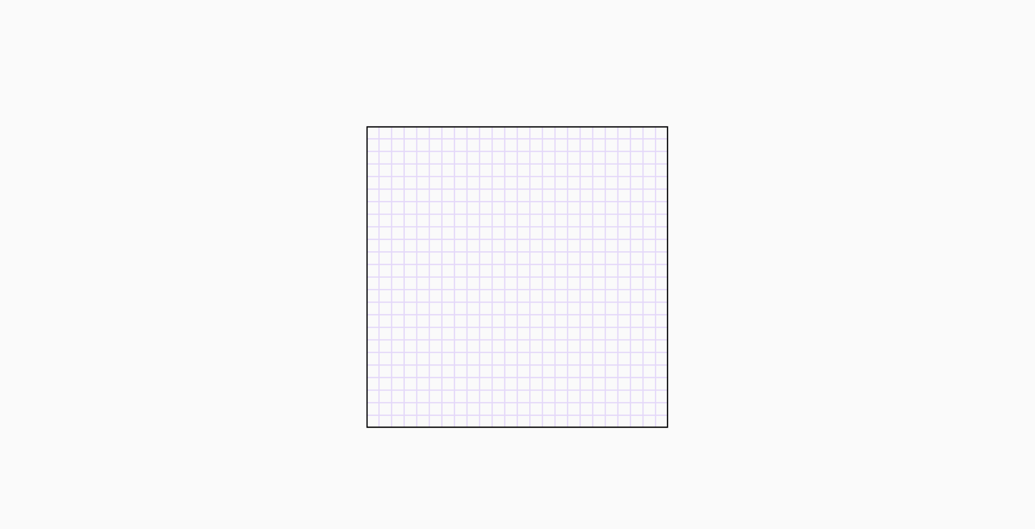
An icon grid is a pixel-based system of guides and spacing rules that icon designers use to maintain visual consistency and alignment. Its primary purpose is to ensure uniform size, optical balance, scalability, and harmony when icons are viewed together in a user interface. Without a proper grid, icons can appear inconsistent, low quality and negatively affect user experiences.
The use of grids in icon design was popularized by German graphic designers, Otl Aicher and Gerhard Joksch. They set the standard for modern icon design with the pictograms they created for the 1972 Munich Olympics.

Since then working with icon grids has grown to become the industry standard. Over time, these grids adapted to the needs of digital design, leading to the introduction of standardized measurements and developments of supporting elements like keylines. While we try to predict how the icon grid will evolve next, it's essential to understand its form and function today.
Key Components of an Icon Grid:
Every icon grid consists of three key components: the frame, the grid, and the padding. Each element plays a specific role in ensuring visual consistency. Together, they provide a solid foundation for designing cohesive and well-structured icon sets.
Frame

The frame marks the icon's boundary, acting as a container for all design elements. It determines your icon's size, which is uniform across a set. Frames come in various sizes, chosen based on project's needs and icon's function. Common sizes are 16x16px, 24x24px, and 48x48px. Any elements outside the frame may appear misaligned or cropped.
Grid

The grid guides major proportions and alignments. It's a structure of small squares formed by overlapping horizontal and vertical lines, creating units across the frame. Larger icons may use two grids: a primary (larger) grid for overall proportions and a secondary (smaller) grid for finer detail.
Padding

Padding, also called the safe area, functions as a protective zone around your icon's artwork. It provides essential breathing room that serves two key purposes: it stops the icon itself from being clipped or cropped, and it maintains a clear separation from any surrounding elements in the user interface.
What are Keylines
Keylines, also known as key shapes, are fundamental geometric guides that suggest the maximum boundaries for different icon shapes. They are crucial for achieving optical balance and consistency across an icon set. Icons can generally be categorized into 4 shapes, circle, square, long rectangle and wide rectangle.
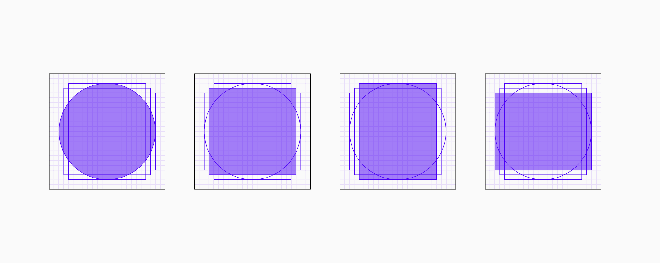
It is important to use tried and tested keylines because they take into account the surface area of each shape. It is a common mistake to assume that shapes which have the same dimension should look uniform when placed together, but that is far from the truth. In fact, depending strictly on dimensions when creating an icon set is a sure way to create a mismatched icon set.

Comparing circles and squares with the same dimension is a great way to show the difference in visual weight that can occur between distinct shapes with the same dimensions

Bring the icon grid and keylines together, you have a strong foundation to start building icons with different shapes and dimensions. It may seem complex at first but when understood it become second nature and you would find yourself designing every icon using an icon grid and keylines.
When to Break the Grid or Override Keylines:
While grids are about consistency, true mastery involves knowing when and how to deviate intentionally for optimal visual impact. This isn't about ignoring the grid, but understanding its limits for perceived balance:
Optical Alignment Necessities:
This is the most common and often essential 'break' from the rules. Not every icon can be forced into the molds provided by grids and keylines, especially within large, diverse icon sets where many designs won't conform to standard shapes. In these moments, trust your trained eye over the grid. Remember, an icon grid is ultimately a guide, not an absolute rule.
Handling Excess Space:
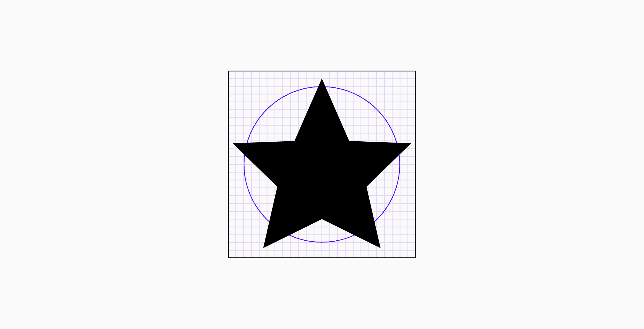
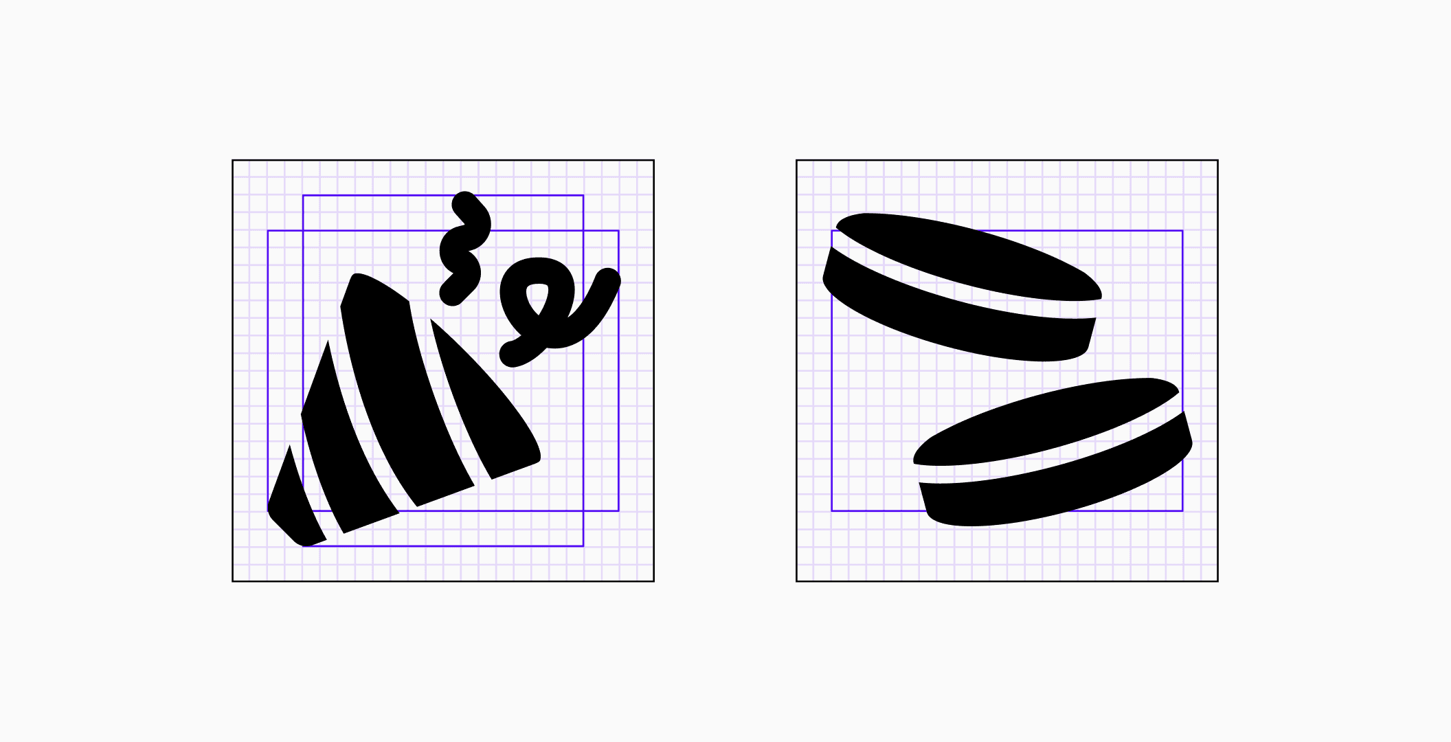
A core goal is to make every icon in a set feel equal on the eyes, even if the pixel dimensions differ. For icons with unusual shapes or a lot of white space, we need to adjust them optically so they look balanced. In this case, it means making the star icon slightly larger than the circular keyline to make up for the negative space between its points, giving it an equal visual presence
Clarity over Consistency:

If fitting an icon into a keyline could affect that clarity of the icon, choose clarity over being consistent with the grid or keylines. In the image above, trying to fit the shoe into the wide rectangle affects the clarity.
Though they may seem like constraints, the icon grid and keylines are actually powerful tools for crafting visually harmonious and scalable icon sets. These elements provide the underlying structure for consistency and cohesion within an icon set, allowing creativity to not just exist but to truly flourish within a well-defined and unified framework.
