
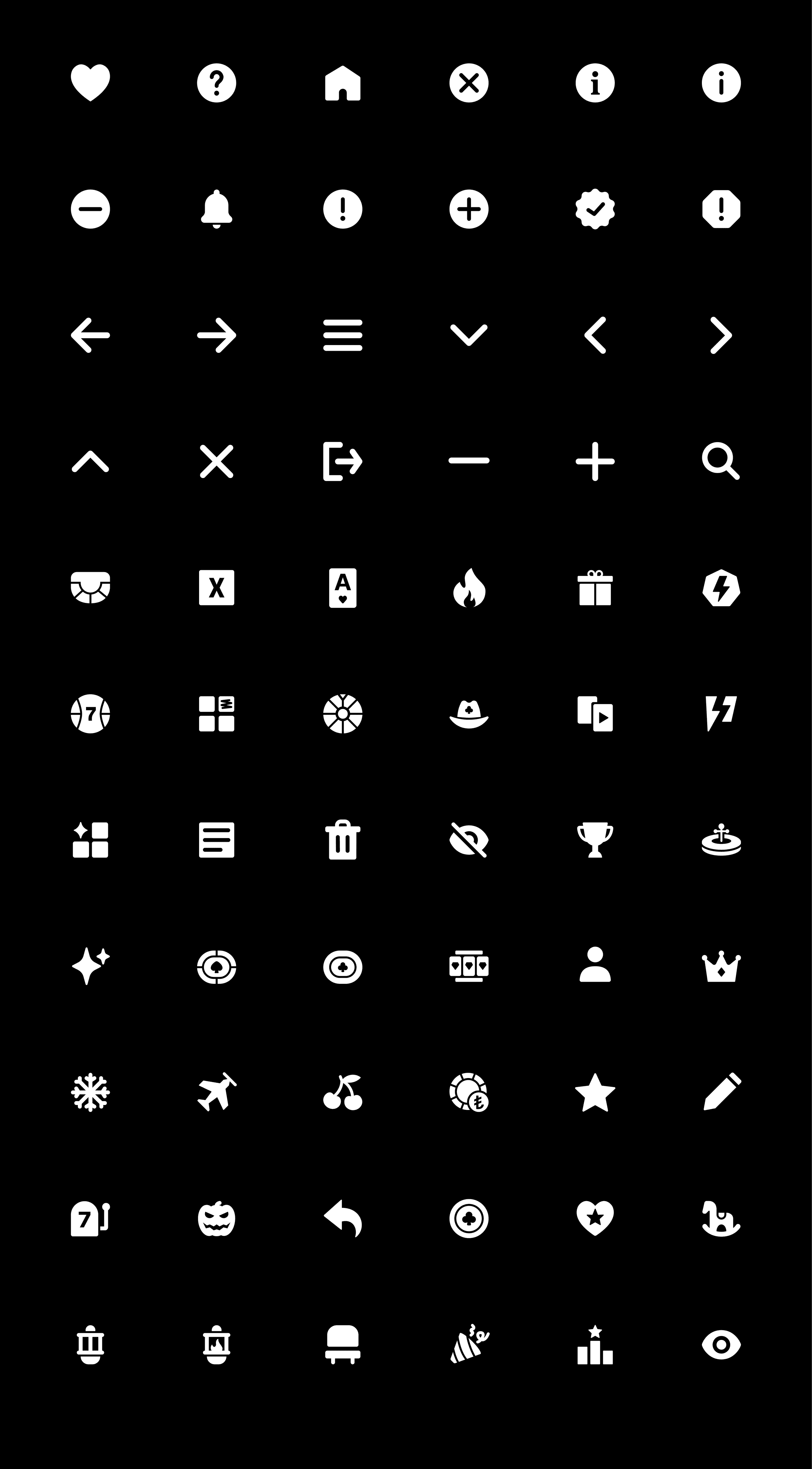
Englyn runs three different gaming apps. Clear icons are key for a good look and easy use. But their old icons weren't working well. They used image files (PNGs) that got blurry. The icons also didn't clearly show what they meant in the games, which confused players. Plus, the icons had different looks, making the apps feel inconsistent. So, the Englyn team hired me to create a new visual style for their icons, starting with some important categories, to fix these problems and make everything look consistent going forward.

Englyn runs three different gaming apps. Clear icons are key for a good look and easy use. But their old icons weren't working well. They used image files (PNGs) that got blurry. The icons also didn't clearly show what they meant in the games, which confused players. Plus, the icons had different looks, making the apps feel inconsistent. So, the Englyn team hired me to create a new visual style for their icons, starting with some important categories, to fix these problems and make everything look consistent going forward.

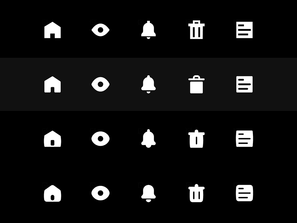


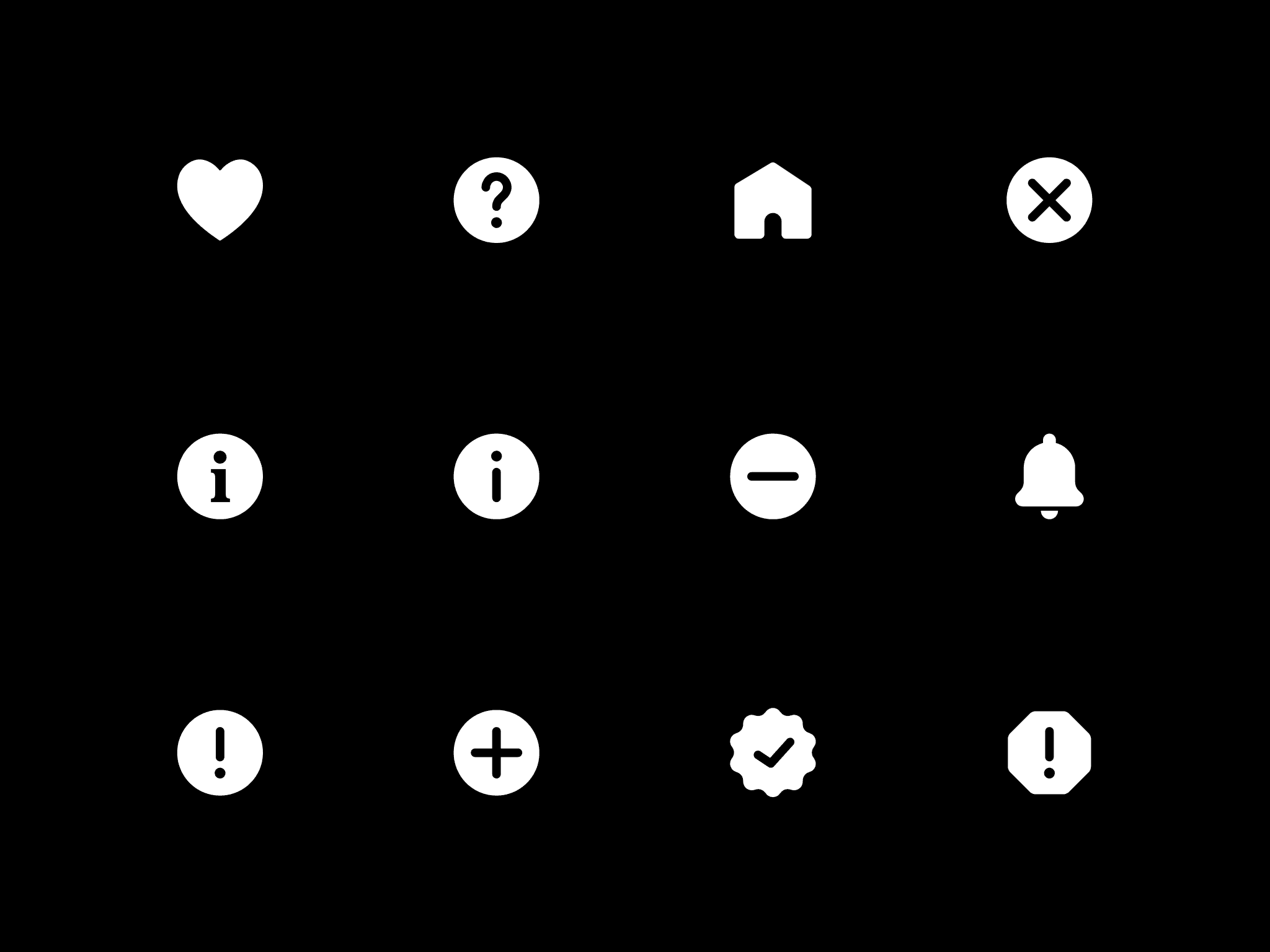
Visual Weight and Alignment Test
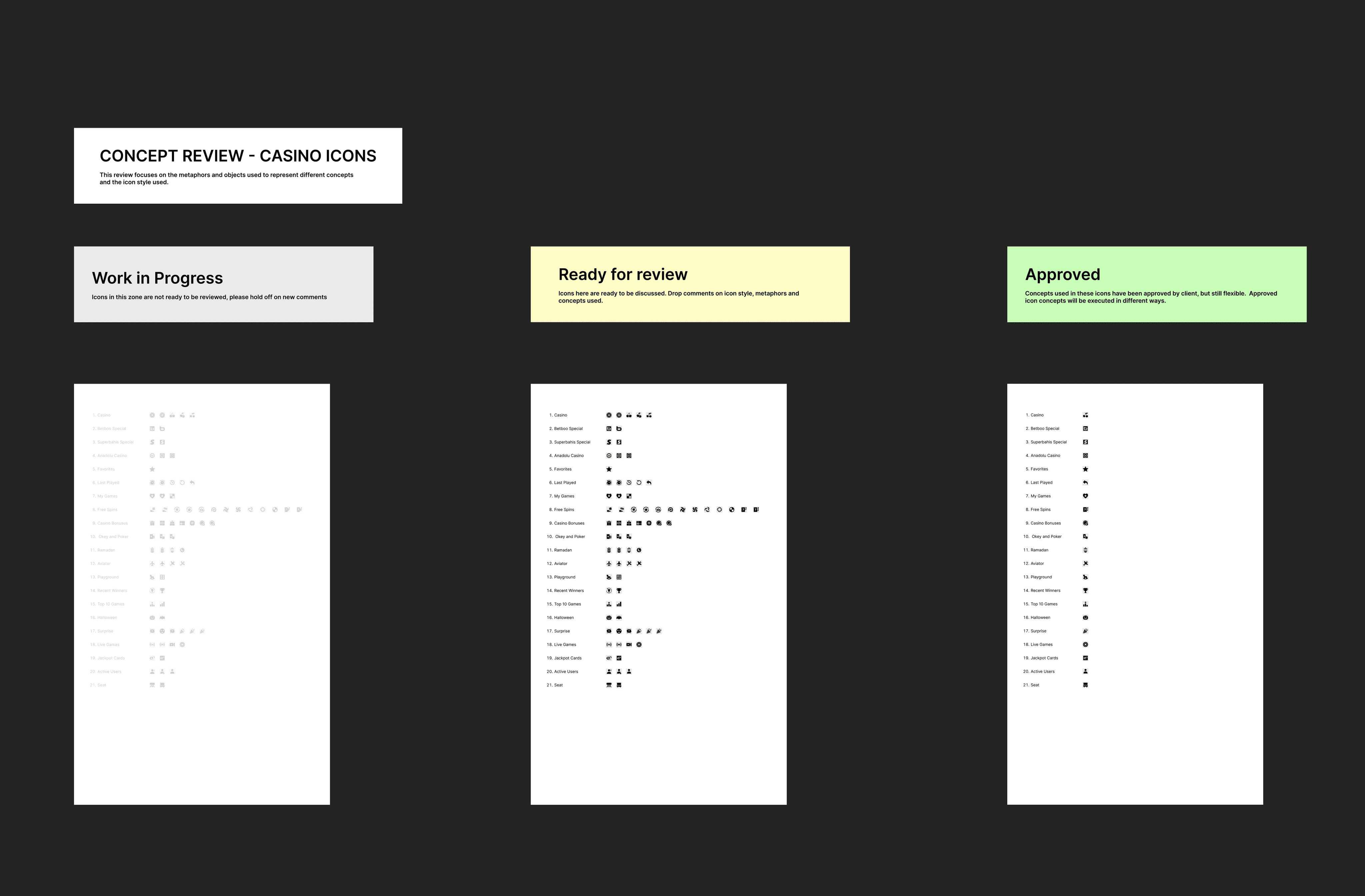
Export and Handover
With careful attention to detail, the icons were prepared for export in both raster and vector formats, using a clear naming system based on category and size. Strokes were expanded and vectors flattened to guarantee consistent visual output across all platforms. Furthermore, comprehensive style guides, including component descriptions and tags, were developed for seamless integration.